


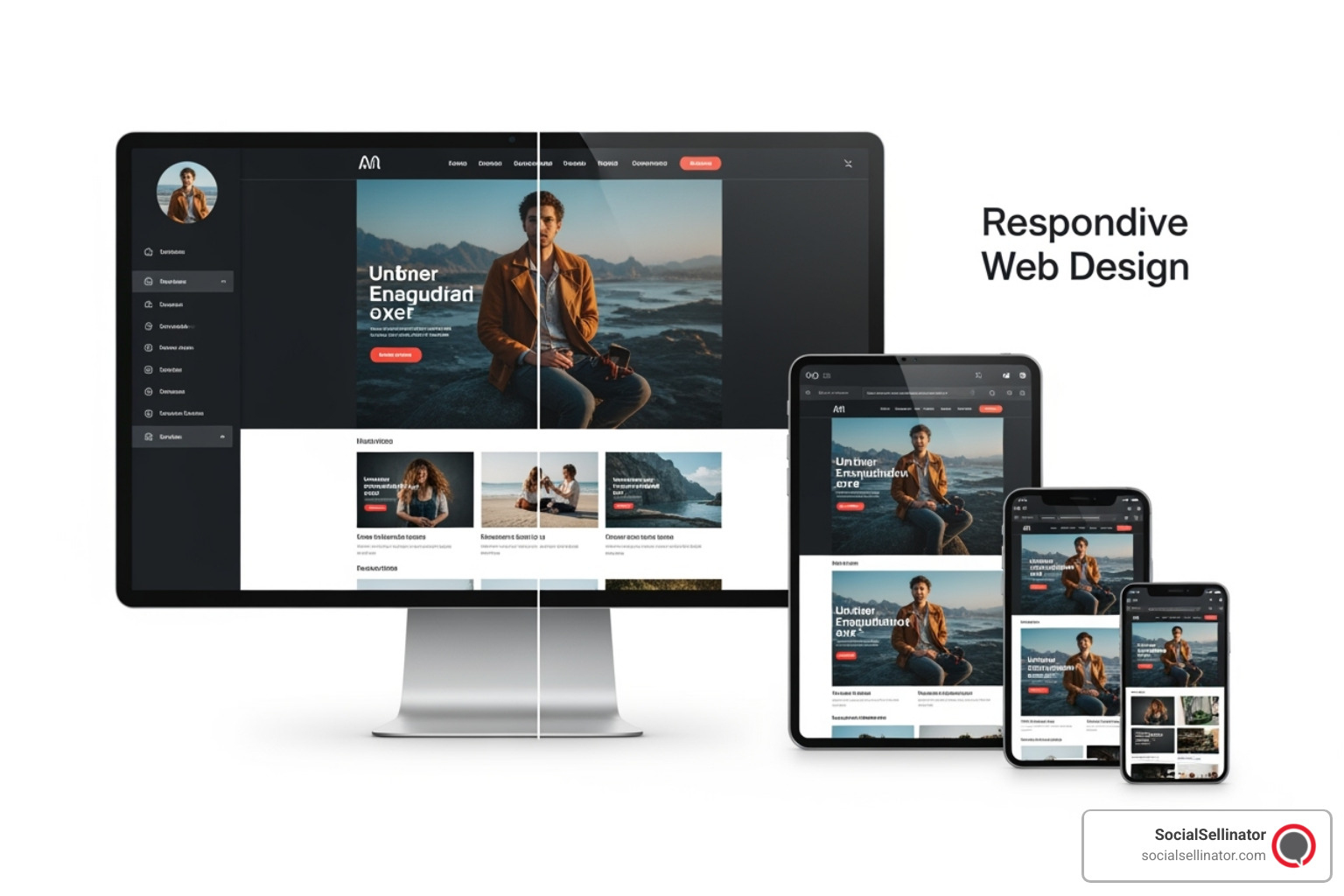
One Website, Countless Screens
Responsive web design is a web development approach that creates dynamic changes to the appearance of a website, depending on the screen size and orientation of the device being used to view it. Instead of building separate websites for different devices, responsive design uses flexible layouts, images, and CSS media queries to automatically adapt content for optimal viewing across all screen sizes.
What Responsive Web Design Includes:
- Fluid grids that resize proportionally based on screen width
- Flexible images that scale without breaking layouts
- CSS media queries that apply different styles for different devices
- Mobile-first approach for better performance and user experience
- Touch-friendly navigation optimized for all interaction methods
Remember when websites looked perfect on your desktop but turned into a nightmare of tiny text and horizontal scrolling on your phone? Those days feel like ancient history now, but they weren't that long ago.
The digital world has exploded with devices. We browse on phones during our morning coffee, tablets while lounging on the couch, laptops at work, and massive desktop monitors at home. Each device has different screen sizes, resolutions, and ways we interact with them.
Creating separate websites for each device used to be the solution. But as Christopher Wren once said about architecture aiming for "Eternity," the web often feels like it's "aiming for next week." The endless parade of new devices with different screen sizes made this approach impossible to maintain.
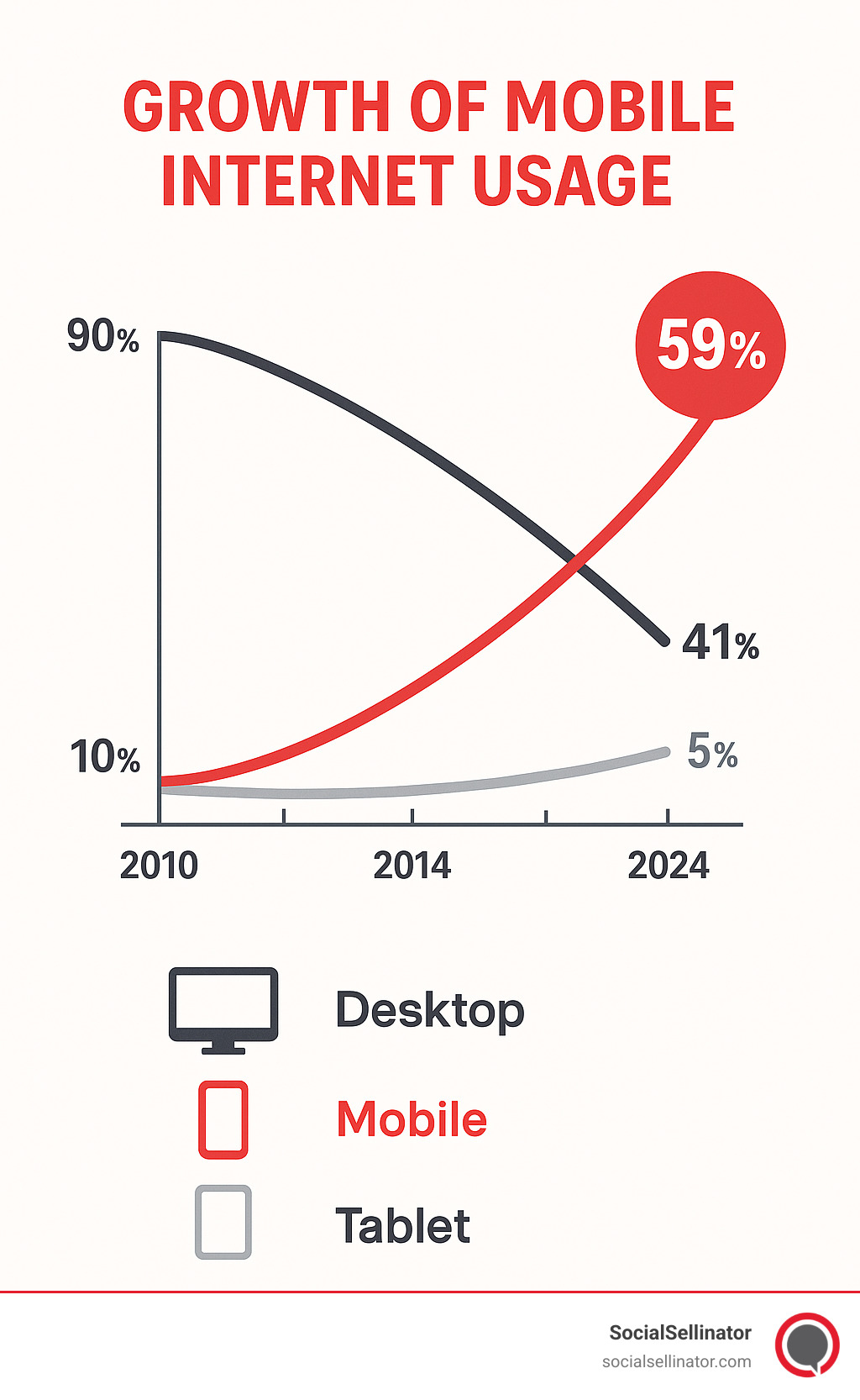
The stakes are high. Over 3 billion smartphones are in use worldwide, and mobile traffic now accounts for more than half of all web browsing. Google's mobile-first indexing means your website's mobile version directly impacts your search rankings. A poor mobile experience doesn't just frustrate users - it costs you customers and search visibility.
Responsive web design solves this challenge neatly. Instead of fighting against the diversity of devices, it accepts them. One website adapts seamlessly to every screen, providing an optimal experience whether someone finds you on a smartwatch or a 4K monitor.
What is Responsive Web Design and Why is it Crucial?
Imagine a visitor finds your site on the train with a phone, saves it, then opens it again later on a 27-inch monitor at work. With responsive web design (RWD) the layout, images, and navigation automatically reshape, so the experience feels identical\u2014no pinching, zooming, or horizontal scrolling.
Why does that matter today? In 2023 there were roughly 6.9 billion smartphone users and mobile accounted for about 59 % of global web traffic. This isn't just a statistic; it's a fundamental shift in user behavior. Mobile users are often goal-oriented and impatient. They expect speed and convenience, and a delay of just a few seconds can cause bounce rates to skyrocket. Google knows this, which is why its mobile-first indexing now evaluates the mobile view of a page before the desktop version. If the phone experience is poor, search visibility, leads, and sales evaporate. That is exactly why Why is Search Engine Optimization Important to a Business stresses mobile friendliness as a ranking factor.
The Problem RWD Solves: A Multi-Device World
Old websites were built like newspapers\u2014fixed widths designed for 1024-pixel monitors. As soon as a 375-pixel phone appeared, everything broke. Text was microscopic, buttons were impossible to tap, and 61 % of users said they would not return to a site that is hard to use on mobile.
For a short time companies launched separate m. domains, but that created double maintenance, inconsistent branding, and SEO headaches. With thousands of new devices\u2014from watches to ultra-wide desktops\u2014building \"one site per screen\" quickly became impossible.
The Unmistakable Benefits for Your Business and SEO
- Better rankings. Google\u2019s 2015 \u201cMobilegeddon\u201d and the more recent Core Web Vitals updates both reward sites that load fast and render correctly on phones. Core Web Vitals measure real-world user experience, focusing on loading performance (Largest Contentful Paint), interactivity (First Input Delay), and visual stability (Cumulative Layout Shift). A well-executed responsive design directly improves these metrics by loading optimized assets and preventing layout shifts as content appears.
- Higher engagement. When layouts fit naturally, visitors stay longer, interact more, and bounce rates drop. A seamless experience across devices builds trust and encourages users to explore your content more deeply.
- Increased conversions. Forms that are thumb-friendly and checkouts that work on a phone increase sales\u2014six in ten shoppers say mobile usability influences which brand they choose. Removing friction from the mobile purchasing process is one of the highest-impact changes a business can make.
- Lower maintenance cost. One codebase means one set of updates. Instead of updating content, fixing bugs, or adding features to two or more separate sites, your team manages a single, unified platform, saving significant time and resources.
- Future-proofing. Responsive layouts stretch or shrink to screens that have not even been invented yet. This isn't just about phones and desktops; it's about foldable devices, in-car displays, and smart TVs. A responsive foundation ensures you're ready for the next wave of technology without a complete overhaul.
In short, responsive design isn\u2019t a design trend; it is the survival kit for a business website in a multi-device world.
The Three Pillars of Responsive Web Design
When Ethan Marcotte coined the term responsive web design in his seminal A List Apart article, he showed that three simple techniques\u2014fluid grids, flexible media, and CSS media queries\u2014could make a single website look perfect everywhere. Twelve years later these pillars still form the skeleton of every modern layout.
Pillar 1: Fluid Grids for a Flexible Foundation
Ditch fixed pixel values and think in proportions. Instead of declaring a sidebar 300 px wide inside a 960-pixel wrapper, you write:
sidebar-width = 300 / 960 = 31.25%
With CSS Grid or Flexbox, those percentages adjust automatically so the same markup flows from phone to desktop without breaking.
Pillar 2: Flexible Images and Media
A single line of CSS prevents most image disasters:
img { max-width: 100%; height: auto; }
Add srcset or the <picture> element to serve lighter files to small screens and high-resolution versions to Retina displays, keeping sites fast and sharp. The same concept applies to video and SVG graphics.
Pillar 3: CSS Media Queries, the Smart Switch
Media queries work like if statements for style sheets:
@media (max-width: 768px) {
  nav { flex-direction: column; }
}
They can test width, height, orientation, resolution, user preference for dark mode, or even a visitor\u2019s request to reduce motion. Pick breakpoints based on where content looks awkward\u2014not on specific device names\u2014and the layout will stay future-ready.
How to Implement Responsive Design: Key Techniques
Transitioning from the theory of responsive design to its practical application involves a set of core, modern web development techniques. Mastering these skills is what transforms a rigid, desktop-centric layout into a fluid, user-friendly experience that works everywhere. These are the essential building blocks for any responsive project.
1. Set the Viewport: The Golden Rule
Before you write a single line of CSS for your layout, you must include the viewport meta tag in the <head> of your HTML document. Without this tag, mobile browsers will assume your site is a non-responsive desktop site and attempt to render it in a virtual viewport, forcing users to pinch and zoom.
This is the essential line of code:
<meta name="viewport" content="width=device-width, initial-scale=1.0">
Let's break it down:
width=device-width: This instructs the browser to set the width of the viewport to the actual width of the device's screen. This ensures your layout is rendered at the correct size from the start.initial-scale=1.0: This sets the initial zoom level when the page is first loaded by the browser, establishing a 1:1 relationship between CSS pixels and device-independent pixels. It prevents the browser from zooming out by default.
This single line is the non-negotiable first step that enables all other responsive techniques to work correctly.
2. Accept a Mobile-First Philosophy
A mobile-first approach is a content-focused strategy where you design and build for the smallest screen first and then progressively improve the layout for larger screens. This is the opposite of the older "graceful degradation" method, which started with a complex desktop site and tried to slim it down.
The mobile-first workflow looks like this:
- Base CSS: Write your foundational CSS to make the content look great on a small mobile screen. This typically involves a single-column layout, legible font sizes, and large tap targets.
- Media Queries: Use
min-widthmedia queries to add styles for larger screens. As the screen gets wider, you can introduce multi-column layouts, adjust spacing, and add features that only make sense on a desktop.
This approach offers significant advantages:
- Cleaner Code: It forces you to prioritize essential content and functionality, leading to a more focused user experience and simpler, more maintainable CSS.
- Better Performance: Mobile devices download a simpler, more streamlined stylesheet. They don't have to download complex desktop styles only to then override them with mobile-specific rules.
3. Master Modern CSS for Layouts
Gone are the days of using floats and hacks for layouts. Modern CSS provides two powerful layout systems that make creating responsive designs intuitive and robust: Flexbox and Grid.
CSS Flexbox for One-Dimensional Control
Flexbox is designed for laying out items in a single dimension—either as a row or a column. It is perfect for component-level layouts, such as navigation bars, form elements, or a row of cards.
Key properties include:
display: flex: Turns an element into a flex container.flex-direction: Defines if items are arranged in aroworcolumn.justify-content: Controls alignment along the main axis (e.g.,space-between,center).align-items: Controls alignment along the cross axis.flex-wrap: wrap: Allows items to wrap onto the next line if they run out of space.
CSS Grid for Two-Dimensional Mastery
CSS Grid is a two-dimensional layout system, meaning it can handle both columns and rows simultaneously. This makes it the ideal tool for creating the overall page layout, including headers, footers, sidebars, and the main content area.
With Grid, you can define complex layouts with just a few lines of CSS. The grid-template-areas property is especially powerful, as it allows you to create a visual representation of your layout directly in your CSS, making it incredibly easy to understand and modify with media queries.
4. Implement Fluid Typography and Spacing
For text to be readable on all devices, it must scale appropriately. Using fixed pixel (px) values for font sizes can cause accessibility issues and prevent text from adapting to different screen sizes.
Instead, use relative units:
rem: This unit is relative to the font size of the root (<html>) element. It's the preferred unit for font sizes and spacing because it scales predictably and respects a user's browser-level font size settings.clamp(): The modern CSSclamp()function is a game-changer for fluid typography. It allows you to set a minimum size, a preferred scalable size (often based on viewport width), and a maximum size. For example,font-size: clamp(1rem, 4vw, 2.25rem);ensures your heading is never too small on mobile or too large on a 4K monitor.
5. Design Responsive Navigation Patterns
Navigation is one of the biggest responsive challenges. A horizontal list of links that works on a desktop will not fit on a narrow mobile screen. Common solutions include:
- The "Hamburger" Menu: A three-line icon that toggles a hidden menu. While ubiquitous, it can hurt engagement by hiding key navigation options.
- Priority+ Navigation: This pattern displays the most important navigation links and tucks the remaining items into a "More" dropdown menu. This keeps primary actions visible while maintaining a clean layout.
- Bottom Tab Bar: Popular in native mobile apps, this pattern places key actions in a bar at the bottom of the screen, well within the user's thumb zone.
6. Optimize Images and Media for Every Device
Large, unoptimized images are the number one cause of slow websites. Responsive design requires serving images that are not only flexible in the layout but also optimized for performance.
- Resolution Switching with
srcset: Thesrcsetattribute on an<img>tag allows you to provide a list of different-sized image files. The browser will then automatically download the most appropriate one based on the user's screen resolution and viewport size, preventing a small phone from downloading a massive desktop image. - Art Direction with
<picture>: The<picture>element gives you even more control. You can use it to serve entirely different images or crops at different breakpoints. For example, you can show a wide landscape image on desktop but a tight, portrait-oriented crop of the main subject on mobile. - Modern Image Formats: Use next-gen formats like WebP and AVIF. They offer superior compression and quality compared to older formats like JPEG and PNG, resulting in smaller file sizes and faster load times.
- Lazy Loading: For images and iframes that are below the fold (not immediately visible), use the native
loading="lazy"attribute. This tells the browser to wait to download these assets until the user scrolls near them, dramatically improving initial page load speed and saving data for mobile users.
Best Practices and Common Challenges
Best Practices
- Content-first breakpoints – Expand the viewport until something looks cramped; that width becomes your breakpoint.
- Responsive typography – Size text with
remorclamp()so copy stays between 45–80 characters per line for comfortable reading. - Thumb-friendly navigation – Tap targets of at least 44 × 44 px and important actions placed in the lower center "thumb zone" on phones.
- Performance – Compress images, adopt modern formats like WebP, and lazy-load below-the-fold media. Faster pages mean higher Core Web Vitals scores and better SEO. Our Website Optimization Near Me service focuses on exactly that.
- Accessibility – High-contrast colors, focusable menus, alt text, and ARIA roles keep content usable for everyone. Review against the WCAG 2.2 guidelines.
Common Pitfalls
- Hiding critical content – Mobile users often need the same information as desktop visitors.
- Over-engineered menus – Deep hover-based navigation fails on touch devices; keep structures shallow and obvious.
- Gigantic hero images – Serve smaller files for small screens with
srcsetor they will crush performance. - Ignoring landscape tablets – Always rotate test devices before launch.
- Testing only in emulators – Real-world devices reveal scrolling glitches and performance bottlenecks you will never see in a browser simulator.
Avoiding these traps turns a responsive layout into a delightful user experience.
Tools and Frameworks to Streamline Your Workflow
Modern tooling means you no longer need to hand-code every grid column.
Built-in Browser Tools
Chrome DevTools, Firefox Developer Tools, and Safari Web Inspector all have Responsive Design Mode for quick breakpoint checks, touch emulation, and network throttling. They are perfect for daily development, though final QA still belongs on real hardware.
Popular CSS Frameworks
- Component-Based Frameworks: These comprehensive toolkits offer a pre-designed grid system and a vast library of ready-to-use components like navigation bars, buttons, and forms. They are excellent for getting a polished, consistent prototype or website live very quickly.
- Utility-First Frameworks: This approach provides a set of low-level, single-purpose utility classes that can be composed directly in your HTML. Instead of writing custom CSS, you build complex designs by combining existing classes (e.g., for flexbox, padding, or text color), offering immense flexibility and control for custom-custom interfaces.
Many teams mix framework components with native CSS Grid / Flexbox layouts for maximum control.
Testing, Auditing, and Validation
- Google Mobile-Friendly Test — Instant confirmation that basic requirements are met.
- WebPageTest — Detailed metrics on first contentful paint, total load, and cumulative layout shift.
- Cloud-Based Testing Suites — For ultimate confidence, cloud testing platforms provide access to hundreds of real physical devices, browsers, and operating systems. This allows you to test for edge cases and performance issues that simulators might miss.
Combine automated checks with short user-testing sessions (five people often surface 80 % of usability issues) and analytics review to ensure your responsive work meets real-world needs.
At SocialSellinator, our Website and SEO Services Near Me package includes framework selection, performance hardening, and cross-device testing so you can launch with confidence.
Conclusion: Accept Responsiveness for a Better Web
The journey through responsive web design reveals a fundamental truth: the web has always been flexible, and the best websites work with this flexibility rather than against it. What started as an innovative approach by Ethan Marcotte has become the bedrock of modern web development, changing how we think about digital experiences.
The numbers tell an undeniable story. With 6.97 billion smartphone users worldwide and mobile traffic claiming 59% of all web browsing, responsive design has shifted from "nice to have" to "absolutely essential." Google's mobile-first indexing doesn't just reward responsive sites - it practically ignores those that aren't optimized for mobile. Your search rankings, user engagement, and bottom line all depend on how well your website adapts to the devices your customers actually use.
We've explored the three foundational pillars - fluid grids, flexible images, and CSS media queries - but today's responsive design reaches far beyond these basics. Modern responsive sites accept advanced CSS layout techniques, prioritize lightning-fast performance, ensure accessibility for all users, and adapt to individual preferences like dark mode and reduced motion sensitivity.
At SocialSellinator, we've witnessed the transformative power of responsive design across hundreds of client projects. Businesses see immediate improvements in search rankings when their sites become mobile-friendly. User engagement increases dramatically when visitors can easily steer and interact with content regardless of their device. Conversion rates climb when checkout processes work seamlessly on smartphones and tablets.
Perhaps most importantly, responsive design future-proofs your investment. New devices emerge constantly - from smartwatches to large-screen TVs with browsers - but responsive sites adapt automatically. You're not building for today's devices; you're building for devices that don't even exist yet.
The implementation strategies we've covered provide a roadmap for success. The viewport meta tag might seem like a small detail, but it's the key that open ups your responsive design. Mobile-first thinking forces you to prioritize what truly matters, creating cleaner designs that benefit users on all devices. Modern CSS techniques like Flexbox and Grid make complex responsive layouts surprisingly straightforward.
The tools available today make responsive design more achievable than ever. Whether you choose a comprehensive framework like Bootstrap, accept utility-first approaches like Tailwind CSS, or craft custom solutions with modern CSS, the key is selecting the approach that best serves your users and business goals.
Testing remains crucial because responsive design isn't a one-time implementation - it's an ongoing commitment to user experience. Real devices behave differently than simulators, and new browsers and devices constantly change the landscape. Regular testing ensures your responsive design continues delivering excellent experiences as technology evolves.
Looking ahead, responsive design will continue evolving with new CSS features and emerging device types. But the core principle remains constant: great websites adapt to their users, not the other way around. When someone visits your site, they shouldn't have to struggle with tiny text, impossible-to-tap buttons, or horizontal scrolling. They should feel welcome, regardless of how they choose to access your content.
Your website often provides the first impression potential customers have of your business. When that first impression might happen on a smartwatch during a morning jog, a tablet on a living room couch, or a desktop computer in a busy office, responsive web design ensures you make a great impression every single time.
The web is inherently responsive - HTML flows and adapts naturally until we force it into rigid boxes. Responsive design simply accepts this natural flexibility, creating digital experiences that welcome everyone, everywhere, on any device. When you design responsively, you're not just building a website - you're creating an inclusive digital presence that grows with your business and adapts to your customers' changing needs.
Our Digital Marketing and Web Designing services integrate responsive design principles into every project because we understand that your website serves as the cornerstone of your digital presence. A responsive website isn't just a technical achievement - it's a business strategy that ensures you're always ready to serve your customers, however they choose to find you.
Headquartered in San Jose, in the heart of Silicon Valley and the San Francisco Bay Area, SocialSellinator proudly provides top-tier digital marketing, SEO, PPC, social media management, and content creation services to B2B and B2C SMB companies. While serving businesses across the U.S., SocialSellinator specializes in supporting clients in key cities, including Austin, Boston, Charlotte, Chicago, Dallas, Denver, Kansas City, Los Angeles, New York, Portland, San Diego, San Francisco, and Washington, D.C.
